A friend of a friend of mine put together two lovely images for the front cover of FlashWire. As is my wont, I’ve been tinkering with colours and lettering, and now have 10 images, 5 of each original, and I wouldn’t mind some help in deciding which one to use. I like all of them, which isn’t much help. The images are:
IMAGE ONE
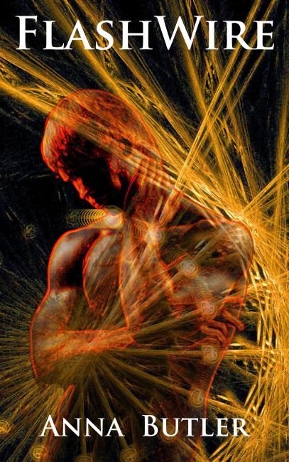
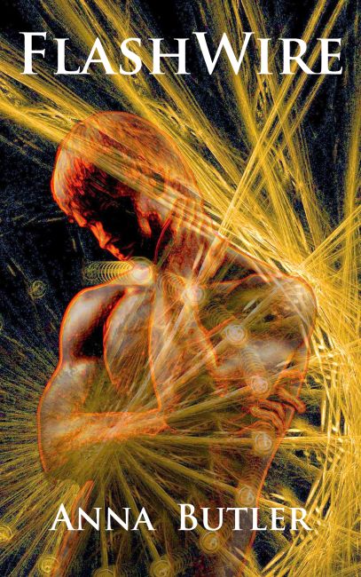
 test1
test1
 test1A
 test 1B
 Test 1C
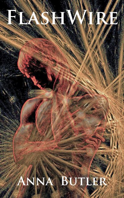
 Test 1D
And IMAGE TWO
 Test2
Test2
 Test2A
 Test2B
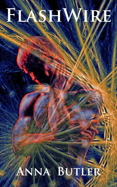 test2C
 Test 2D
So, which would you choose?

I like test 1. I’m drawn to darker colours.
LikeLike
I like that and test 2, too. It’s hard to make up my mind!
LikeLike
I like quite a few of these! Now, this is very much YMMV, but I don’t think your name is clear enough on 1A/1B. My favorite image is test1. I love the way his face is in shadows, making me wonder who what he looks like, who he is. I also like the lines/shiny stuff (my, I’m eloquent tonight…) in this one. They’re not too bright, and I can pick out a lot of details.
LikeLike
I think that there’s too much pale colour in 1A and 1B, so there’s not enough contrast with the white lettering. But there’s also too much going on to make the reversed-out lettering a different colour. I think you’re right – those two are probably out of the running. Thanks!
LikeLike
I like 1D. The colors are more intense and the figure is larger and more compelling.
LikeLike
I owe this all to you!! Thank you!
I like that one, too. That’s the trouble! I’m going to have to plump for one of them and I’m wavering…
LikeLike
They all look lovely, but I definitely prefer Test 1 of all the first sets of images. Of the second, Tests 2A and 2D are my favourites. I don’t know if that helps at all…
LikeLike
It all helps, thank you!
LikeLike
I had a hard time scrolling back through them–I think it would have been easier to see which ones I liked if I could see them all at the same time–but I have to go with 1D myself. I like the cooler colors and as someone else said, the lettering is clearer there too. What program are you using? This is pretty cool!
LikeLike
It’s done in Photoshop – I’m a tyro with it, but I do like playing. I was inclining towards 1D until Jess, below, commented that it looked like his nipple was exploding. Now I’m sort of sad about that while laughing my socks off.
LikeLike
At first I was torn between Test1 and Test2 simply because of the colors, then I realized what was bugging me about Test1 — it looks like his nipple’s exploding. I like the placement of the light strands much better in Test2.
lady_alys from LJ
LikeLike
SNORT!!! So it does. You know, I hadn’t noticed that and now its all I can see!
LikeLike
Id or 2c. I like the blue cast.
LikeLike
Thank you! There’s a general consensus that the bluer ones look best. I agree – the yellows and reds are too ‘hot’ and don’t really fit the story itself.
LikeLike
I like image 1 test 1, but they are all lovely.
LikeLike
Morning, m’dear! Thank you! I loved the first image until Lady Alys mentioned exploding nipples 😦
LikeLike
I like either test 1b or 2b, mainly because, while a book cover should be eye catching, I don’t think it should be *too* eye catching.
LikeLike